Whammy: A Display Font That Lifts Your Digital Brand
Last week, I was finalizing the hero section of a new landing page for a small creative coaching practice — clean layout, warm photography, minimal navigation. But something felt off in the headline. The current sans serif was functional, but it didn’t carry the warmth or quiet confidence the founder wanted to project. So I pulled up my font library and dropped in Whammy.
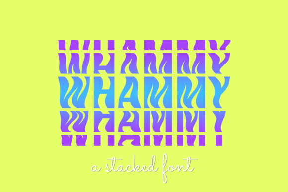
Right away, it clicked. Whammy isn’t flashy — it’s confidently friendly. It’s a display font with subtle rounded terminals, gentle contrast, and just enough character to feel intentional without sacrificing clarity. Think of it as the typographic equivalent of a thoughtful smile: approachable, memorable, and quietly polished. It doesn’t shout — it invites.
I tested Whammy across real layout scenarios: over a soft-focus background image (it held up beautifully with modest letter spacing), in a sticky header on scroll (still legible at 24px on mobile), and inside a primary CTA button (“Start Your Journey”). In each case, it added visual weight without overwhelming. That’s the sweet spot for a display font like Whammy — not for body text, not for dense paragraphs, but for moments where you want users to pause, recognize tone, and feel aligned with your voice.
For digital creators, Whammy works especially well in contexts where personality matters more than neutrality. A boutique online store selling handmade ceramics? Perfect for banner headlines and collection titles. A course sales page for mindful productivity? Ideal for section headers like “What You’ll Gain” or “Your First Module.” A portfolio site for an illustrator? Gorgeous as a name treatment above work samples or in social media graphics exported from Figma.
Readability is where Whammy shines in practice — not in theory. On desktop, it’s clear and open at 32–48px. On mobile, I found 28px with 1.2 line-height and slight tracking (+20) kept it crisp and scannable, even on lower-DPI screens. Over dark backgrounds, I added a soft white text shadow (1px blur) for extra lift. Over light images, a subtle semi-transparent overlay behind the text ensured contrast met WCAG AA standards — Whammy’s generous x-height and open counters made that adjustment feel effortless.
It’s worth noting: Whammy is designed as a single-weight display face — no bold or italic variants. That’s not a limitation; it’s a design decision. It means Whammy thrives when paired intentionally. I consistently paired it with a neutral, highly legible sans serif for body copy — think Inter, Manrope, or even system fonts like -apple-system for fast-loading performance. That pairing creates clear hierarchy: Whammy sets the mood, the sans serif delivers the message. For a more editorial brand, try Whammy with a warm, low-contrast serif like Cormorant Garamond — just keep paragraph sizes generous and line lengths moderate.
Before dropping Whammy into any live project, I always check three things: webfont format support (WOFF2 included — great for performance), licensing scope (yes, it covers commercial use, client sites, and SaaS dashboards), and multilingual character coverage. Whammy supports Latin-based languages thoroughly — including accented characters used across Western European languages — which matters whether you’re building a bilingual blog header or localizing a campaign page for Canadian or Australian audiences.
In practice, Whammy performs best in short, high-impact roles: logo lockups (when used as wordmark text), hero titles, section dividers, testimonial highlights, email subject lines, and digital ad banners. I wouldn’t use it for navigation labels, form fields, or anything requiring rapid scanning at small sizes — that’s not its job. Its strength is emotional resonance, not utility. And that’s exactly why it elevates so many digital touchpoints without asking for attention.
One real moment that stood out: testing Whammy in a product landing page’s value proposition stack. Instead of generic bullet points, each benefit started with a Whammy-powered headline (“Clarity, Not Clutter”), followed by concise sans serif body text. Users scrolled slower there — not because the page loaded slowly, but because the typography created a natural rhythm. That subtle shift in pacing reinforced trust. It felt human-made, not template-built.
Font pairing isn’t just aesthetic — it’s UX hygiene. Whammy’s friendly geometry pairs cleanly with geometric sans serifs, but can feel visually tense next to overly rigid neo-grotesques like Helvetica Neue. I’ve had the most success with humanist sans fonts that share its warmth: Poppins (with slightly reduced weight), Lato, or even a custom variable font set to a softer optical size. Avoid stacking multiple decorative fonts — Whammy doesn’t need backup singers. Let it lead, then step back.
If you’re evaluating Whammy for your next project, ask yourself: Where do you want users to *feel* something before they read anything? That’s Whammy’s zone. It’s not a Swiss Army knife — it’s a well-crafted chisel. Use it to carve out space for authenticity in a crowded digital landscape. Whether you're refreshing a blog header, designing a digital brand kit for a creative entrepreneur, or building a campaign landing page that needs to stand out in a feed, Whammy adds polish without pretense.
And one last practical note: Whammy comes with standard OpenType features — ligatures, stylistic alternates, and case-sensitive forms — all accessible in modern design tools and CSS via font-feature-settings. I’ve used the alternate ‘g’ and ‘a’ in logo mockups to add nuance, and enabled discretionary ligatures for hero text on high-DPI displays. Small touches — big difference in perceived craft.
At its core, Whammy reminds me why typography still matters in web design: it’s how tone becomes tangible. Not every font earns a place in your active UI kit. Whammy does — thoughtfully, quietly, and with unmistakable charm.