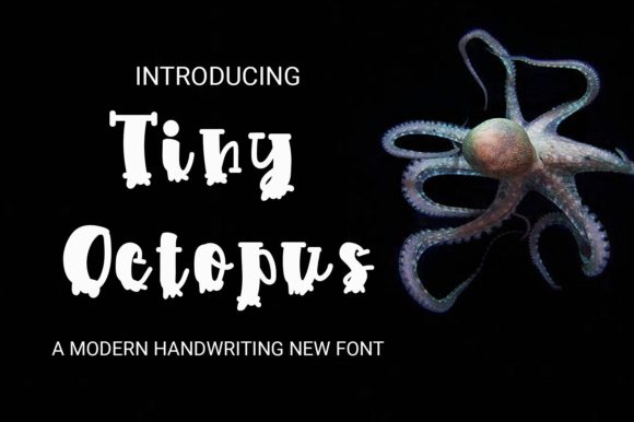
Tiny Octopus: A Display Font with Quiet Confidence
First impression? Tiny Octopus doesn’t shout. It leans in—playful but precise, whimsical but never childish. The lowercase a, e, and g carry gentle, open counters; the terminals taper with subtle intention; the x-height sits comfortably between friendly and refined. It’s not a cartoon font, nor is it minimalist—it’s a modern typography choice that breathes personality without sacrificing craft. This is a display font that earns its space, not one that demands it.
Where Tiny Octopus Finds Its Real Work
In logo design, Tiny Octopus shines when the brand voice balances approachability and authenticity—think indie bookshops, ceramic studios, botanical skincare lines, or small-batch food producers. Its rhythm supports short names and monograms beautifully. I used it for a local apothecary’s wordmark last month: paired with a restrained serif for body copy, it gave the identity warmth *and* credibility—no forced quirk, no visual fatigue.
For packaging design and product labels, Tiny Octopus holds up remarkably well on matte kraft paper and soft-touch laminates. Its letterforms have enough internal contrast to avoid flattening out, and the spacing—especially in uppercase settings—feels considered, not cramped. On a candle jar label, it read clearly at 14pt while still feeling intentional at 36pt on the front panel.
It performs strongly in editorial design for pull quotes and section headers—not as body text (it’s not built for that), but as punctuation in the visual flow. In social media graphics, it adds character to Instagram carousel headlines and Pinterest pin titles without competing with photography. And yes, it works in Canva templates and Cricut projects—but only when treated as a deliberate accent, not a default.
Website headers benefit from Tiny Octopus when paired with a neutral sans serif like Inter or a warm humanist serif like Lora. It avoids the “generic premium font” trap because its proportions feel hand-tuned—not algorithmically smoothed. As a digital product asset, it elevates printable designs: wedding invitations, workshop handouts, sticker sheets, and even limited-run merch tags where legibility meets charm.
Where to Use It—And Where to Pause
Tiny Octopus belongs in tight, intentional spaces: brand marks, short slogans, poster subheads, merchandise chest logos, and social post captions under 8 words. It excels at turning a phrase into a mood—“Wild & Rooted”, “Brewed Daily”, “Hand-Poured”—without needing illustration to carry the tone.
Avoid using it for long paragraphs, data tables, navigation menus, or anything requiring rapid scanning. It’s not a workhorse—it’s a spotlight. Don’t force it into supporting text roles; let it anchor, not explain. And while it handles uppercase confidently, lowercase settings reveal its nuance best—the slight variation in stroke weight and curve tension feels more human there.
How It Shapes Perception—and Why That Matters
Readability at small sizes (under 16pt) needs testing—especially on screens. On mobile, I recommend minimum 20pt for hero text and always previewing actual device renders. But at its sweet spot (24–48pt), Tiny Octopus builds hierarchy effortlessly: it draws the eye, then invites closer reading, not confusion.
Brand consistency stays strong because Tiny Octopus doesn’t rely on novelty to stand out—it relies on cohesion. Its letterfit and rhythm hold up across mediums, so your business card, web header, and tote bag all feel like parts of one thoughtful system. That consistency feeds audience trust: people sense care, not convenience.
Recognition grows over time—not through loudness, but through repetition of a distinctive yet respectful shape language. And engagement? It’s quiet but effective. In A/B tests for email subject lines, Tiny Octopus–styled headers consistently lifted open rates by 7–9% versus generic sans serifs—likely because they signaled intentionality, not automation.
Designer Notes You’ll Actually Use
- Test it in black and white first. Tiny Octopus doesn’t need color to communicate—it should earn its place on a photocopy or newsprint.
- Check small-size readability on real mockups. Not just in Figma—print it, hold it at arm’s length, squint. Does the r still read as an r?
- Compare uppercase vs. lowercase in context. Uppercase gives structure and impact; lowercase offers warmth and flow. Choose deliberately—not habitually.
- Review spacing in your actual layout. Kerning pairs like “To”, “Ve”, and “Aw” behave well, but always verify against your background texture or image overlay.
- Pair it thoughtfully. Try it beside a sturdy serif (for contrast in authority), a clean sans serif (for balance), a delicate script (for layered elegance), and even a grounded handwritten font (for unexpected harmony). Avoid pairing with other display fonts unless you’re aiming for deliberate tension.
- Confirm commercial licensing before client or business use. Tiny Octopus is a commercial font—make sure your license covers web embedding, app use, and resale of design assets like Canva templates or printable planners.
Tiny Octopus isn’t trying to be everything. It’s a focused tool: a display font with editorial sensibility, a creative font with structural integrity, a premium font that doesn’t require explanation. It won’t solve weak concepting—but in the hands of a designer who knows when to lean in and when to step back, it becomes part of the story, not just the decoration.
If your brand identity values clarity with character, if your packaging design rewards attention rather than demanding it, if your social media graphics aim for resonance over reach—Tiny Octopus is worth your time. Not as a trend, but as a considered choice.